
Project / Concorde Accommodation
Task / Logo and Visual Identity Design, Collaterals
Client / Concorde Hotel Kuala Lumpur
Year/ 1993–1995 (estimated)
Lead designer & Typographer: William Harald-Wong
A WHW Legacy Project—1993+
Formerly known as the Merlin Hotel between 1957 (the year of Malaysia’s Independence) to 1990, the Concorde Hotel has been an enduring hospitality landmark in Kuala Lumpur, where generations have dined in its ‘Dragon Court’ Chinese Restaurant (now known as ‘XIN Cuisine’).
Facing stiff competition from new 5-star hotels sprouting around Kuala Lumpur in the mid-90s, the height of Kuala Lumpur’s economic boom, the old 4-star Concorde Hotel decided on a strategic move to dedicate two upper floors to premium suites—with a complete makeover, manned by their best staff to offer superlative service.
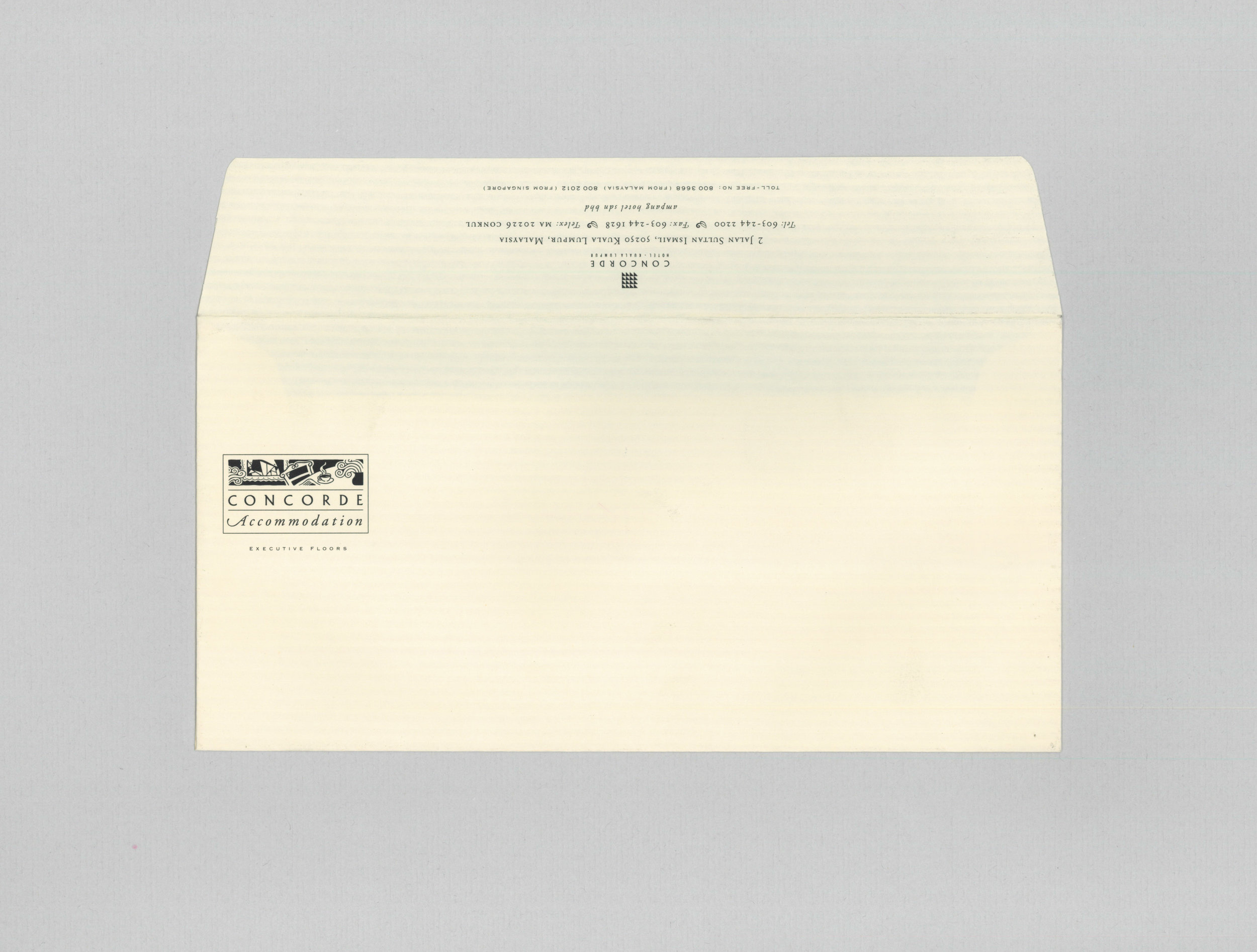
The hotel approached me to create a new premium brand for these two floors, named ‘Concorde Accommodation’ to differentiate them from the lower floors. Although we have had considerable experience designing for other industries, this was our first hotel identity project.
“Clients always ask to see the work in our portfolio that is relevant to their industry. But if you have enough experience, exposure, and expertise in the field of design, does it really matter?
Good design is intelligent and imaginative—in form and function—and requires the ability to read and engage the audience. It does not depend on past projects of a similar nature as each company, its products, services, and brand should be unique.
In fact, by not having done ‘dozens of hotels before’, we bring a totally fresh perspective to the industry.”
I started by looking at how these new 5-star hotels branded themselves, and realised that all of them had a preference for glossy, full-coloured materials. So we decided to go against the grain, working the entire brand identity of Concorde Acommodation—including the marketing materials—around just one colour: black, printed on white or cream-coloured paper.
The strength of the design lies in typography—how a single font (Adobe Garamond) is used to create a distinctive and elegant personality for the premium suites.
Concorde Hotel
CONCORDE ACCOMMODATION


Concorde Hotel
THE MELTING POT
The Melting Pot Cafe, on the ground floor of Concorde Hotel, caters to all hotel guests, as well as visitors and a noisy lunch crowd. The ambience is lively, the throng is chatty, and as its name implies, the café offers culinary dishes from Peninsula Malaysia’s major ethnic communities.
The twirling newspaper cuttings in English, Malay, Chinese, and Tamil on the menu covers reflect this cultural diversity, and they represent the idea of ‘newsworthy chit-chat (or gossip/hot air)’ rising from a music stand or ‘a star event in the night sky’.
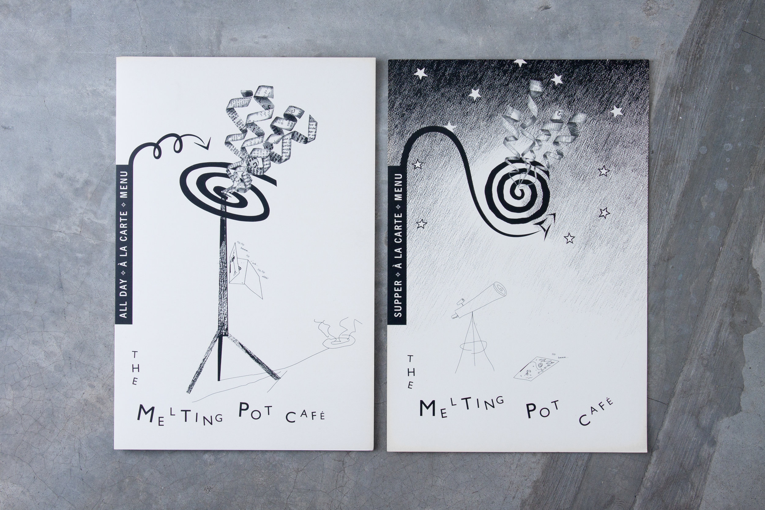
Menu covers

The ‘All Day’ menu (inside, partially open), with flap.

The ‘All Day’ menu (inside, fully open).
Our experimental black-and-white approach reinforced the Concorde Hotel brand as innovative and fun—in contrast to Concorde Accommodation—a brash new kid on the block (the hotel’s Hard Rock Cafe is just next door).
Our work for Concorde Hotel continued for a number of years and included the newsletter, calendar, festive greeting cards, etc., until the management changed hands.