
Project / Publika, Kuala Lumpur
Task / Logo & Visual Identity Design
Client / Sunrise Berhad
Year / 2010
In collaboration with labDNA, social architects
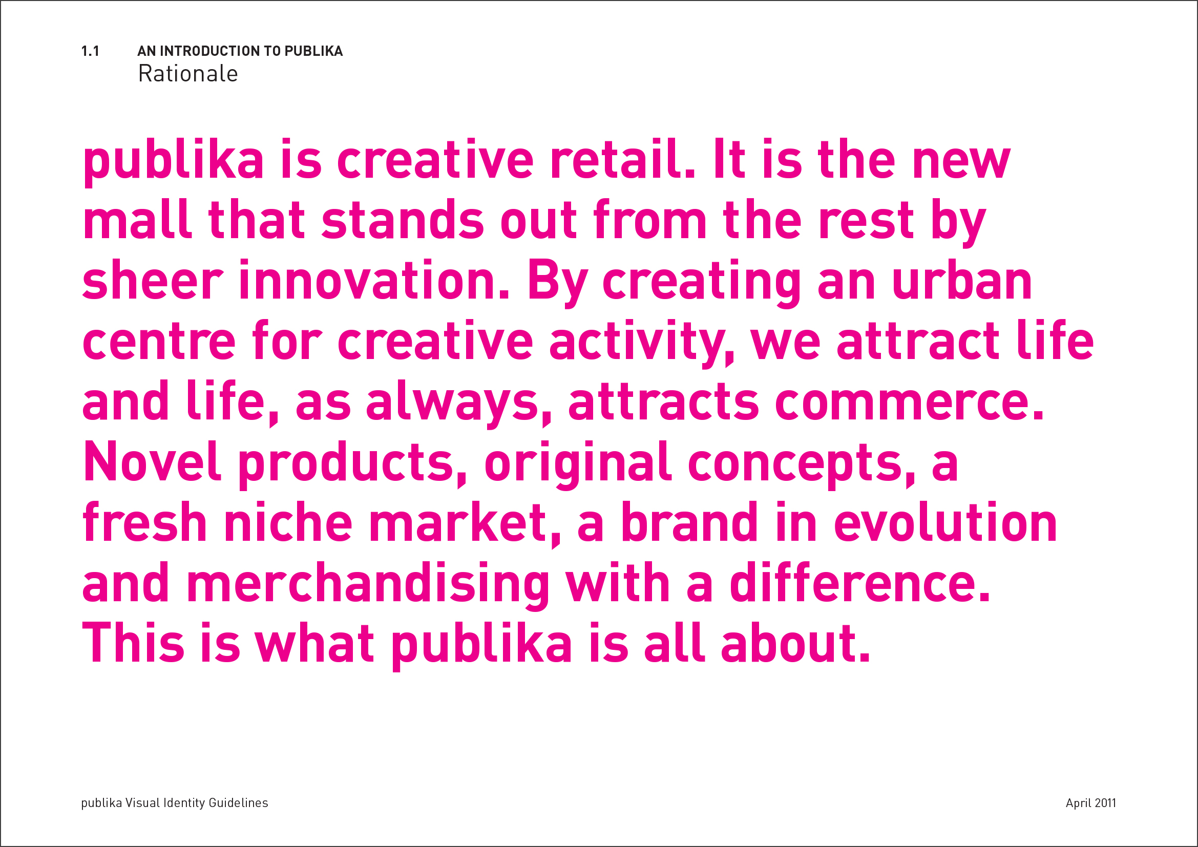
Publika Shopping Gallery is a retail mall-cum-creative hub, anchored by a unique concept called MAP (Making Art Public), an activity generator with two key spaces, the White Box (for exhibitions) and the Black Box (for theatre performances).
Originally built to house corporate offices and retail, labDNA was engaged to position Publika as a creative retail hub instead, which called for some major retrofitting. Our design team developed the logo and visual strategy for both Publika and MAP to reflect the intent and spirit of the new concept.
“The decision to position Publika as a creative retail devoted to arts and culture was a risky one at that time as there were no clear successful precursors. However, it was made as a logical response to current conditions: the lack of a vibrant creative hub in Kuala Lumpur and the affluent neighbourhood communities nearby that may potentially be attracted to such a concept.”


POSITIONING STATEMENT


“It may be of interest to note that the original name was ‘The Republic’ but this was rejected by the authorities as the building was facing the Agong’s (King’s) new palace—how ironic!
Our design team had to immediately jump into the deep end given the urgent deadline to deliver the creatives, taking over from an advertising agency that had been working on this project for almost two years.”
Logo & Typeface design
A unique typeface was specially designed for Publika. Its folded forms create a three-dimensional effect, but done so in an illogical manner—the forms do not follow a rational folding system.
The eccentricity of this typeface is deliberate because it is meant to capture Publika’s character as a place that is full of surprises and new discoveries, as well as its community’s fun, playful, and edgy personality.


Typographer / designer Yee Weng Chiang was commissioned to design the typeface and the full set of characters.

The typeface is applied to the food court (above) and map (below). The architects saw some exciting possibilities to adapt the typeface’s letterforms as street furniture, but that did not materialise.

Graphic elements and symbol
Aside from the typeface, we also introduced the ‘deconstructed type’ element and the folded ribbon, both of which were derived from the Publika typeface. The elements are used in the marketing collaterals for Publika.

A question mark symbol was created as a teaser for Publika's launch. Art is widely regarded as a vehicle for evoking reflection and contemplation, and Publika is a place that embodies this. It is a place where ideas can roam free, where both creativity and critical thinking find a home.
Publika's question mark symbol serves as a reminder to not only keep your mind open to new ideas, but to also evaluate them critically.


Buntings

Information panels on wheels for the Publika Sales Gallery.

Launch brochure
Publika as an art and culture hub
To bolster its image as a vibrant art and culture hub, labDNA commissioned many artists, sculptors, and installation artists to produce murals, public seating, etc. For the opening of Publika, artists painted or did an installation for each of the toilets, making each of them an attraction by itself. Artists were also invited to make a statement on repurposed electrical wire spools, which were then scattered around the public areas (photos below, top row, left and right).
