
Project / Hap Seng Re-branding
Task / Stakeholder Interviews + Visual Audit, Logo, Brand Architecture & Visual Identity
Client / Hap Seng Consolidated Berhad
Year / 2005–2006, 2009, 2010–2011
Lead Designer / William Harald-Wong
Stakeholder Interviews & Report / Fatimah Yeop Sendiri
Photography / Staek Photography and MidasTouch
Our team worked closely with the management of Hap Seng Consolidated Berhad (HSCB) to transform what was perceived as a Sabah-based traditional Chinese business (for those not in the know) into a corporation of regional / international stature. In spite of its enviable success over the decades, the Hap Seng brand remains relatively low profile, in accordance to the wish (and character) of its founder, Tan Sri Datuk Seri Panglima Lau Gek Poh.
The re-branding exercise began with interviews with internal and external stakeholders to determine current perceptions of the company. This enabled the management to clarify its core values and sense of purpose, and identify opportunities that the organisation can play to its strengths.
“Our report revealed a divided response. Many staff members were unhappy despite the corporation being a ‘darling’ of bankers and investors, and they did not mince their words, having been given an assurance of confidentiality.
If I recall correctly, this did not please the client, and admittedly there were some shortcomings in the report on our side. Nothing happened in the following months (or a year). Consequently, we assumed that we were taken off the project.
I suppose corrective measures have been taken over this period, and I believe Hap Seng’s excellent reputation today is a result of this management action.”
Revitalising Hap Seng’s logo & Identity

From the outset, we were informed that we should not change Hap Seng’s symbol-mark (logo) and colour identity as it was created by the late Tan Sri Datuk Seri Panglima Lau Gek Poh. Instead, we made an effort to refine the logo, as shown above.
In the logo, Tan Sri’s initials—the letters ‘G’ and ‘P’—were embedded in the symbol-mark, stylised and arranged in a circular design to symbolise the twin aspirations of Unity and Success (the meaning of ‘Hap Seng’ in Chinese).
The logo also takes a cue from Tan Sri's Chinese name (刘玉波; 玉 translates to jade), and bears resemblance to the shape of a penannular jade ring (玉玦)*, an accessory often worn by the traditional Chinese community. During the Han Dynasty, the bearer of a jade penannular ring is seen to be a very decisive and gentlemanly person (君子能决断,则佩玦; translated to ‘a decisive person would wear such a jade’) as the second character of the penannular jade ring (玦) is phonetically similar to the character for 'decisive' (决).
These rings are also sometimes worn by members of the royal family as a reminder to not be complacent and excessively opinionated.
Additionally, the emerald green of the logo was chosen due to its similarity to the colour of jade stones.
* Information obtained with thanks to Freeman Lau.
“According to local Chinese beliefs, a conservative Chinese businessman would avoid having a logo with a break in the circle, as a complete circle represents unity and oneness while the break will allow ‘money to flow out.’
But a ‘crack’ in a jade stone is often not a crack. Instead, it is a natural mark. Women in China often cherish such imperfections because it shows the authenticity of the stone.
There is also an ancient Chinese belief that says jade stones are worn to protect its wearers from negative forces. Numerous stories abound about accidents where a jade bracelet breaks into pieces but leaves the wearer unharmed.
Hap Seng’s jade-coloured symbol-mark is founded upon these auspicious beliefs.”
REFINING THE LOGO

An old Hap Seng sign on a building.

As the symbol-mark cannot be changed, much of our early visual exploration focused on the logotype, ‘Hap Seng’.

The final version. The symbol-mark has been strengthened to better match the bold Hap Seng typeface.

The logotype of the holding company appears in all capitals to differentiate it from its subsidiary companies.
Brand Architecture
A key component of a corporate identity is the corporate structure.
In reality, there are two structures: the organisational structure with its lines of communication and reporting responsibilities; and the visual structure (also sometimes called the brand architecture), which concerns itself with the branding of products, services, business units, and the corporate umbrella, as well as how they are presented to an organisation’s audiences.
In our work for Hap Seng’s corporate identity programme, we focused on the latter.

Mapping the organisation. The current brand architecture is much simplified as business units merged or divested over time.

Identity and the Environment
When we started work for Hap Seng Consolidated Berhad, they were housed in an old office building (late 1980 or early 1990 architecture), located in an industrial zone in an old part of town.
“When Hap Seng first moved to their spanking new modern office in the heart of Kuala Lumpur, I observed a disconnect between the stylish corporate environment and the older female staff members who were dressed dowdily, as though they were still in the old part of town.
It amused me when their sense of style eventually became more fashionable and chic (with coiffured hair). This is clear evidence of how an environment can affect attitudes and bring new confidence.”
A few years later, we were engaged to design a corporate wall in Menara Hap Seng, the corporate headquarters. The Hap Seng story ran along the length of a wall, from the visitors’ lounge to the entrance of the boardroom. We had to make do with existing images, but many of them were either overused or of mediocre quality.
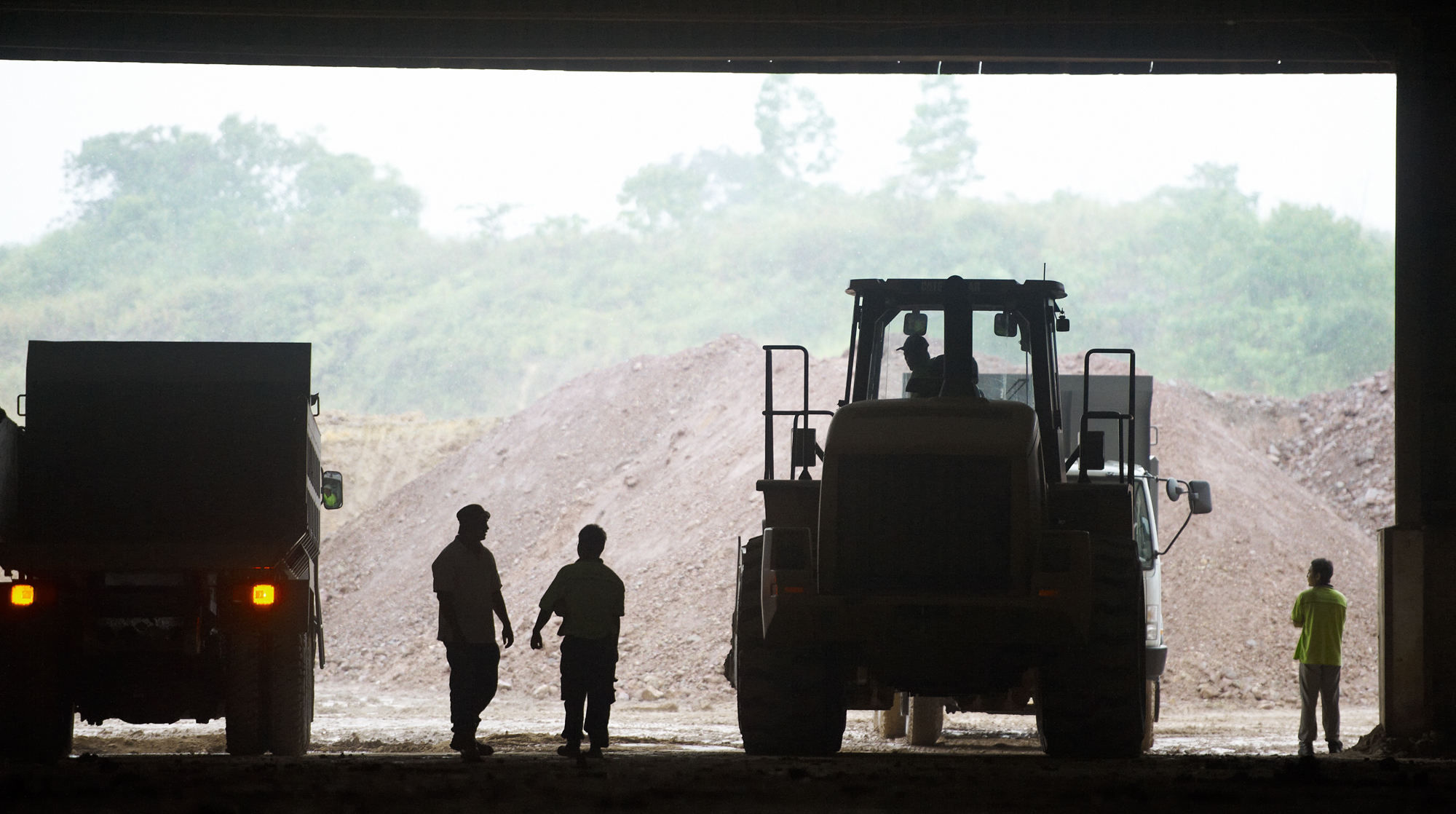
This led us to recommend creating a new library of images for HSCB and its subsidiary companies. We developed the overall look and feel—monumental, larger than life (for environments) and intimate and engaging (for people photos). We prepared a detailed brief for the photographers to create images that communicated this vision.
A nationwide photography shoot was commissioned in 2012.
CRAFTING AN INTERNATIONAL IMAGE


FINAL WORD
“Regrettably, there was an identity issue we could not solve: Hap Seng occasionally receives enquiries from parties, “Are you the biscuit company?”.
In the old days, many households in Malaysia had a large tin of Hup Seng biscuits in the kitchen. It is one of the luminous, nostalgic images of Malayan childhood days. ”