
Project / Slurps + Scoops
Task / Logo & Visual Identity Design covering all items required for a F&B outlet, including packaging and uniforms; Product Brochure
Client / Ideal Foods (Singapore)
Year / 2007
Lead Designer_James Wong
in collaboration with S.I. Design
From the people behind Yami Yogurt, one of Singapore’s most popular yoghurt brands, Slurps + Scoops is positioned as the healthy alternative to fast food, offering hearty sandwiches, light wraps, salads, fruits & vegetable platters, soups and the star product—yoghurt.
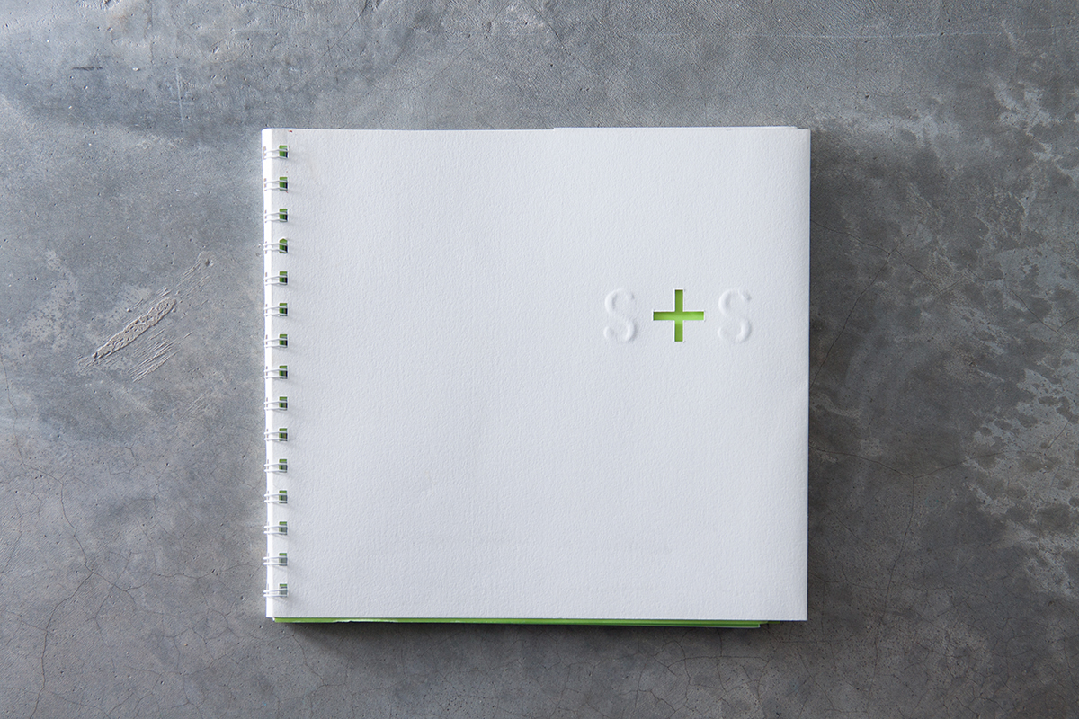
Slurps + Scoops launched with the tagline Where Healthy Meets Delicious. Its visual identity and communication take a minimalist approach: simple typography, judicious use of white space, expressive watercolours and an overall focus on the content itself, resulting in a sophisticated urban feel to the brand.
Identity System

Menu


The tagline ‘WHERE HEALTHY MEETS DELICIOUS’ (or alternatively, its background colour) appears only in green (‘healthy’) or red (‘delicious’). The word ‘MEETS’ is used throughout the communication to invite the reader to engage with the product(s).
Product Brochure


Environmental Graphics


The lettering on the wall is cut out to allow the background colour (green or red) to show through. This technique is applied to most printed materials as well, such as the cover of the product brochure (below).
