
Project / Muzium Masjid Sultan Abdullah, Pekan, Pahang
Task / Information Design, Typography
Client / Lembaga Muzium Negeri Pahang
Year / 2016
Chief Curator / Dato’ Ahmad Farid bin Abdul Jalal
Architects / Tamegoro Nagata & Natsue Nagata
Calligraphy & Logo Design / Faisal Somadi
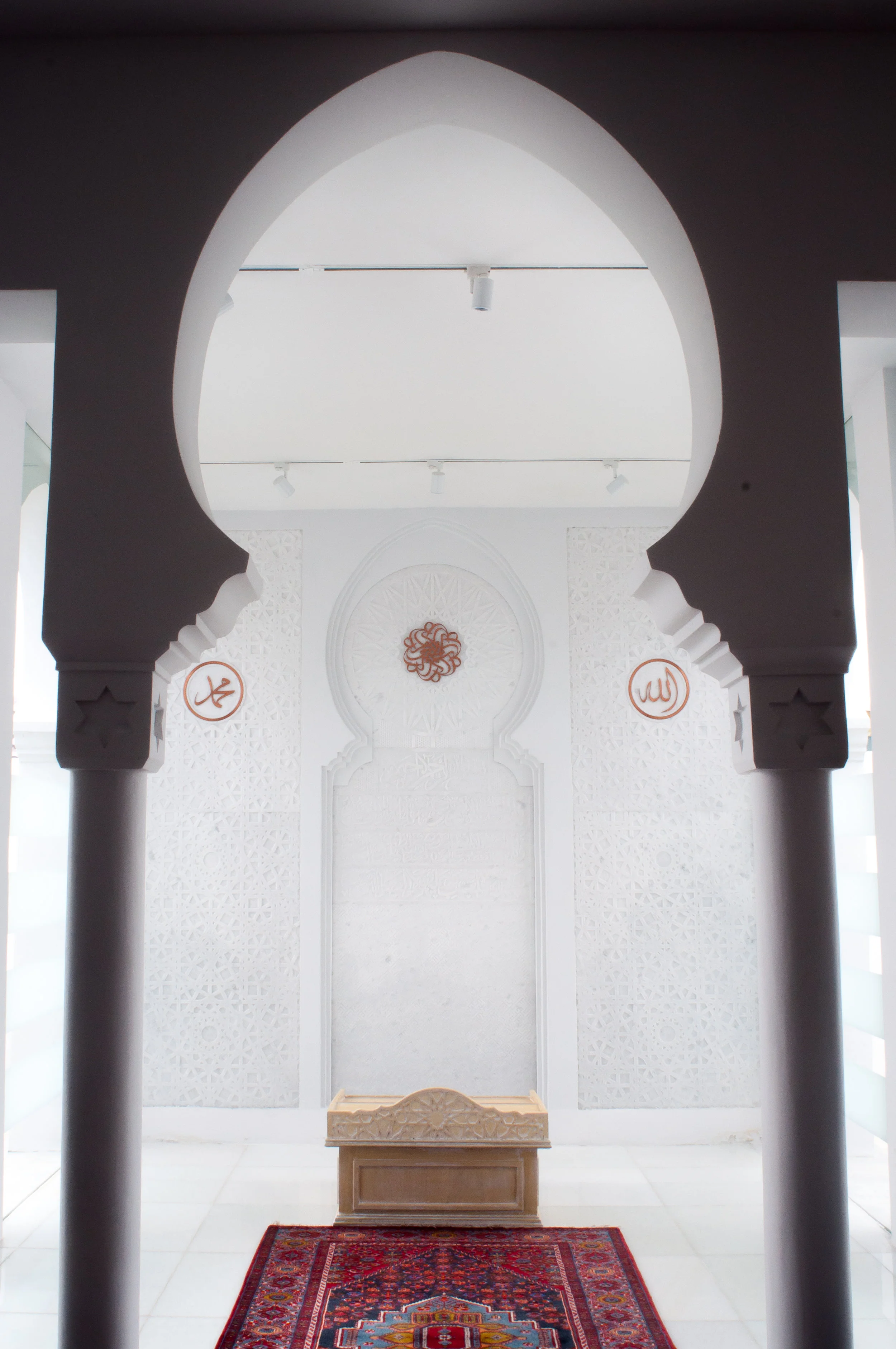
We began designing for the mosque after completing the work for Muzium Sultan Abu Bakar. The mosque, built in the 1930s, has been beautifully restored over two years for its new role as an Islamic art museum.


“A designer ought to leave beautiful spaces alone.
Such was the case for this museum.”

Navigation
Muzium Masjid Sultan Abdullah is a small museum. We felt there was no real need for any wayfinding or signage system as its interior layout, defined by its strong symmetry, was evident to any first-time visitor.
Nonetheless, we had to inform the visitor that there were three thematic zones: The Islamic World, The Malay World, and The Royal Realm. To do so, we placed this information on the exhibition labels as a navigational aid instead of creating a separate set of signs, which would have disrupted the flow of lines in the building.


Information Graphics

Wall Graphic: Timeline of Islam’s Contributions to Human Civilisation.
Wall graphics were designed with a white background to integrate with the overall white space of the mosque, contributing to its elegance, serenity, and purity.

Detail of Timeline


We always look for opportunities to integrate graphics with the architecture and interior. The timeline itself is a photograph of the coloured tiles on the floor of the mosque.


OBSERVATION—I did not think the text on the wall panels should be lengthy (as was done), especially with two languages, when digital devices were available for visitors at every corner of the museum.
There’s wisdom in this quote by Herbert Simon, in V&A’s guideline for gallery text: “What information consumes is rather obvious: it consumes the attention of the recipient. Hence a wealth of information creates a poverty of attention.”
Symmetry & Repetition


The writer, G.K. Chesterton, in his 1920 travelogue, described the mesmerising effect of Arabic script painted on the tiles of walls and dome of Jerusalem’s Dome of the Rock as being “repeated again and again like ornamental stars or flowers... like the chorus of a song... Indeed, one is driven to repeating oneself about the repetition, so overpowering is the impression.”
“The museum’s interior, filled with columns, is magnified by its repeated geometry.
We designed wall panels to mirror the negative space of the colonnades, adding to the museum’s overall symmetry and repetition.”
Light
The white interior of the museum serves as a blank canvas for the interplay of multi-chromatic light cast by the stained glass windows, warm natural sunlight ranging in intensity from strong to weak, reflections, and moving shadows on tinted translucent walls.


Architectural Motif
A geometric design from the mosque was used by the architect as a repeating motif to unify the interior and exterior architectural space. We also adopted this motif for the museum's print communications.


