
Project / The Mansions, Breezeway & Westside II, at Desa ParkCity, Kuala Lumpur
(Current projects 2016–2017: Plaza Arkadia & Westside III)
Task / Wayfinding & Signage
Client / Perdana ParkCity
Year / 2014
The Mansions, Breezeway, and Westside II are three distinctive developments in Desa ParkCity, one of Kuala Lumpur’s most sought-after residential addresses. Each property has its own unique architectural features and a logo designed by an advertising agency.
The existing signage proposal prepared for The Mansions was rejected by the client, and we were requested to take over the signage programme for the residence. We also concurrently designed new sign systems for Breezeway and Westside II. We had to address some crucial safety issues as well as reflect the unique character of each development in our sign design.

“We had to execute the 3 projects concurrently, working with tight deadlines. The tender document for The Mansions was delivered in less than two months, followed by Breezeway and Westside II a few months later.”
Safety
Architects, and the people in planning and engineering, are primarily responsible for creating a safe environment but there are instances where the sign designer has to chip in.
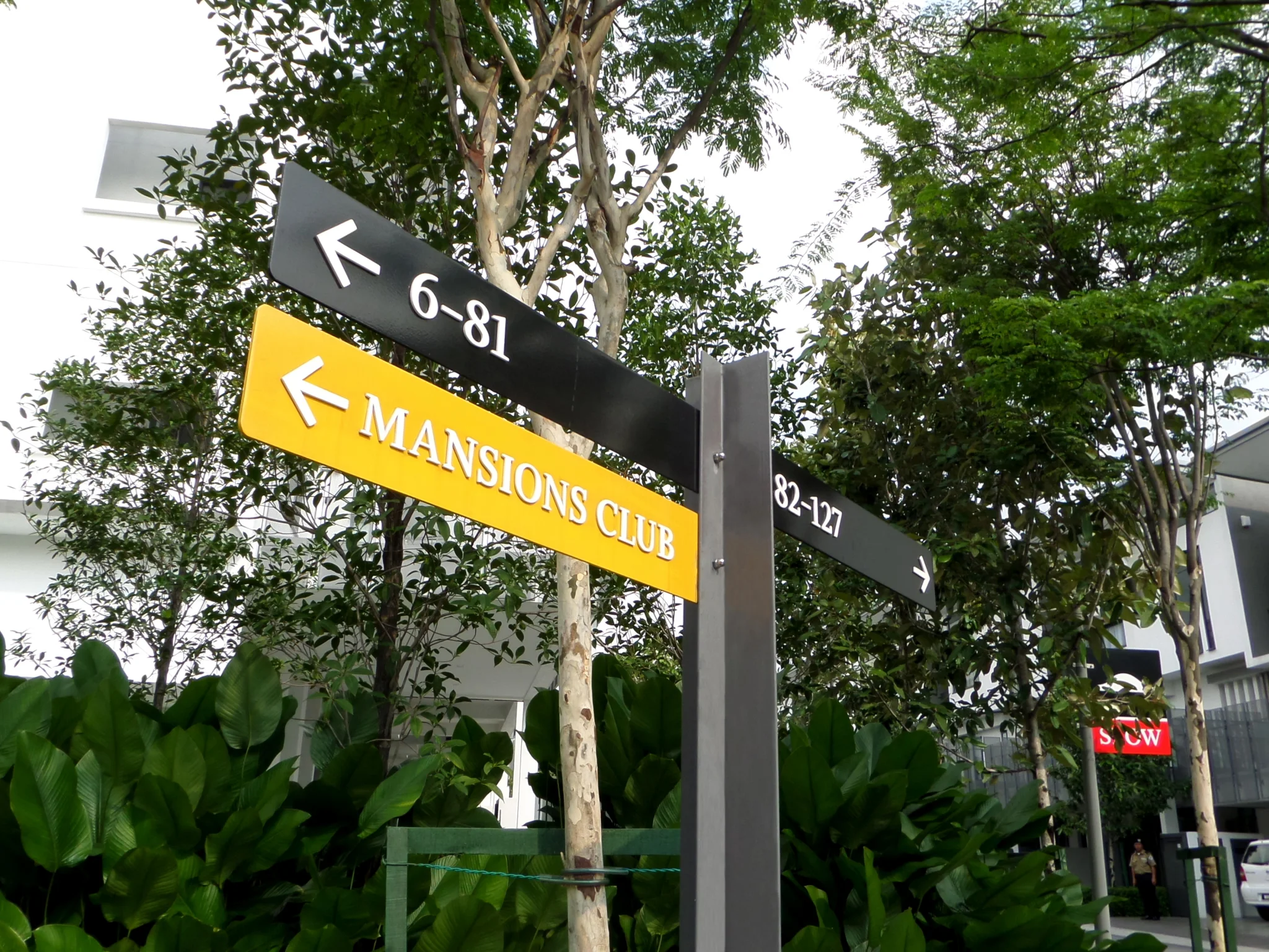
The Mansions
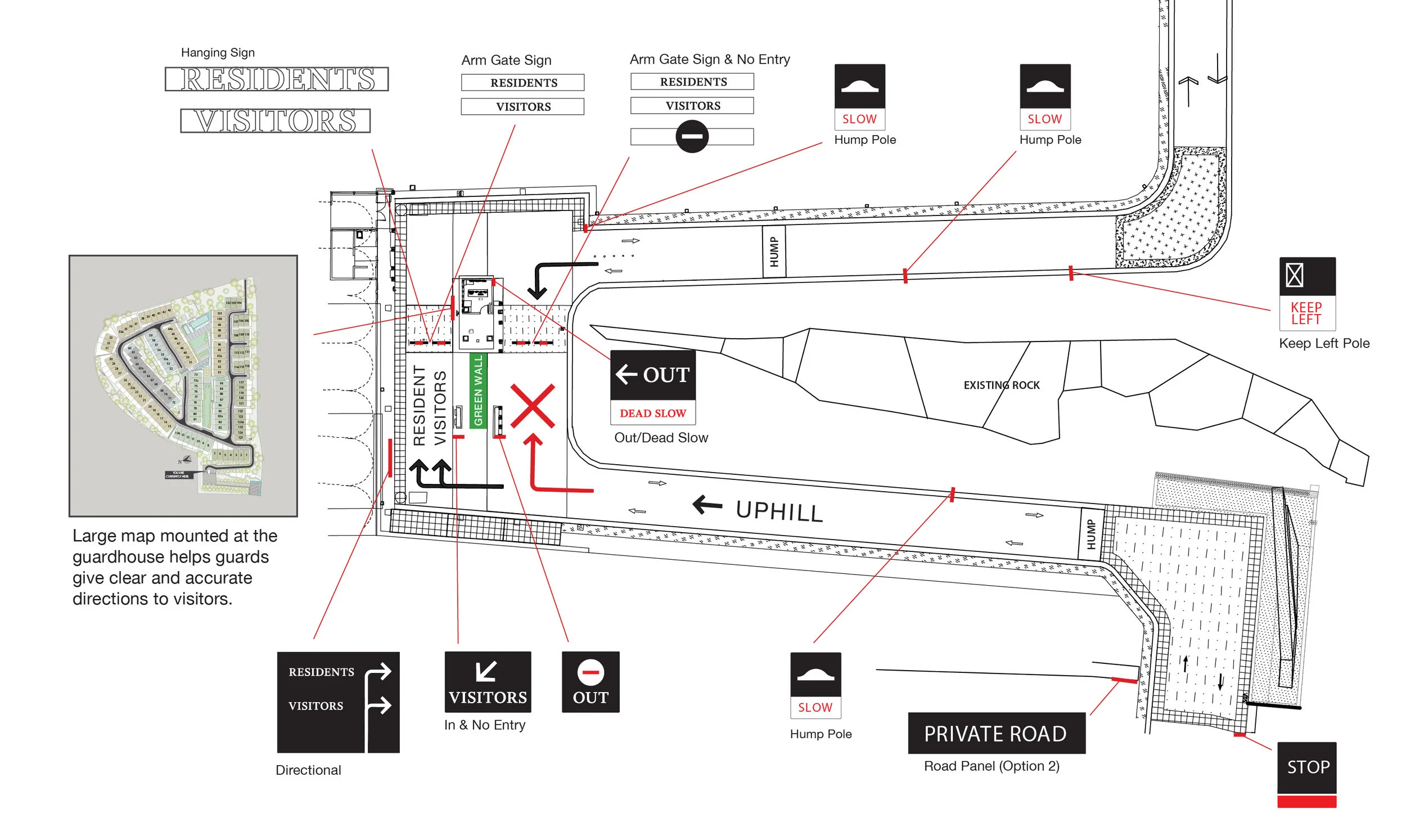
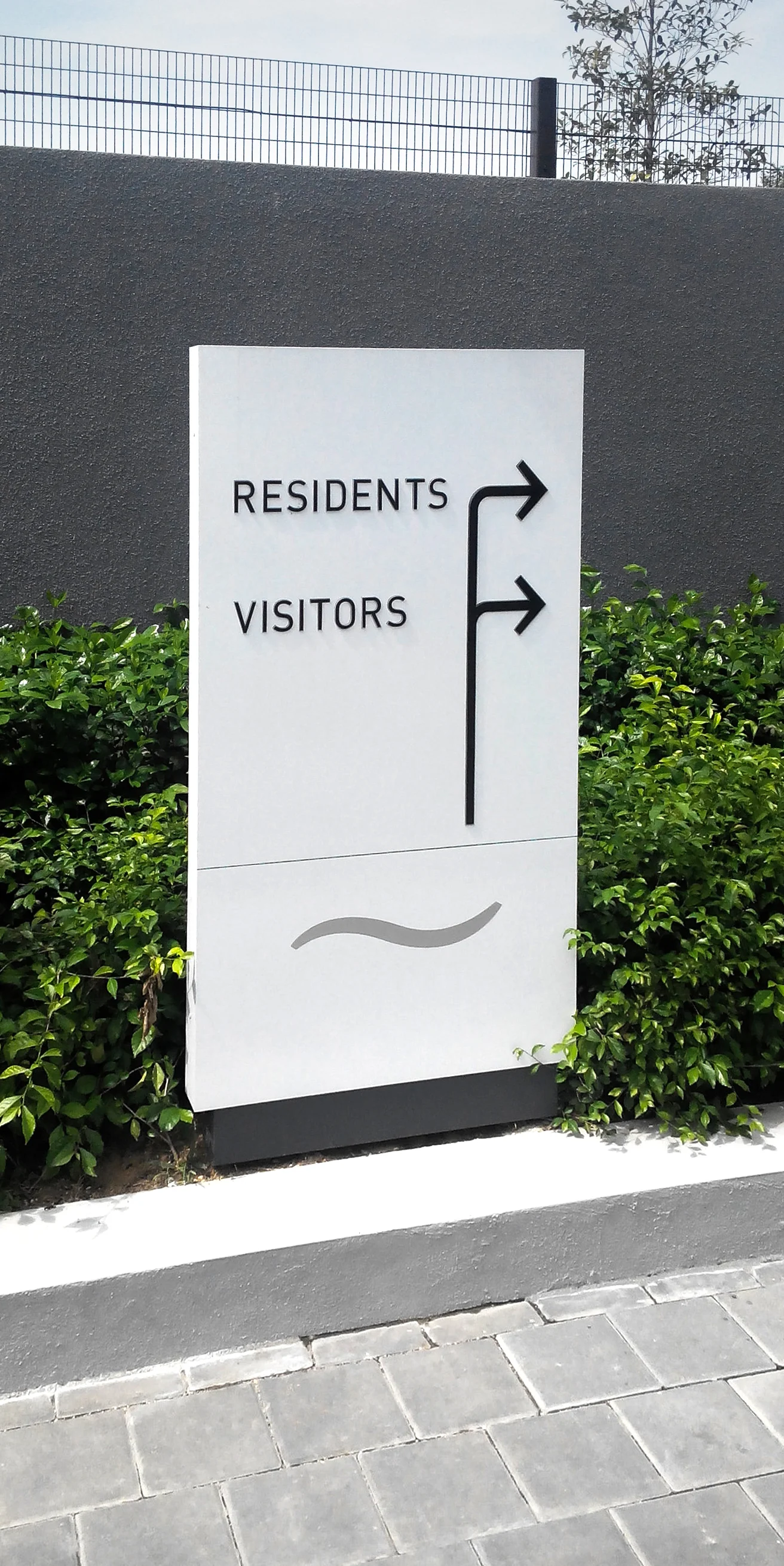
One safety concern was the confusing turn towards the Guard House, which has three lanes: the Exit lane (nearest), Resident’s entrance lane, and Visitor’s entrance lane (furthest).
However, both Resident’s and Visitor’s entrance lanes are obstructed from view by a vertical wall of creepers (indicated in the diagram in green). First-time visitors are likely to turn into the Exit lane instead and face on-coming traffic (marked ’X’ in red).
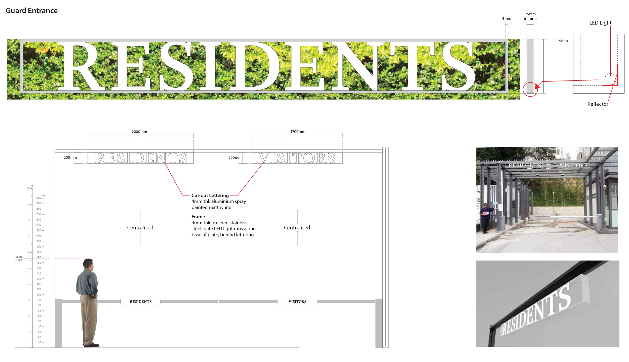
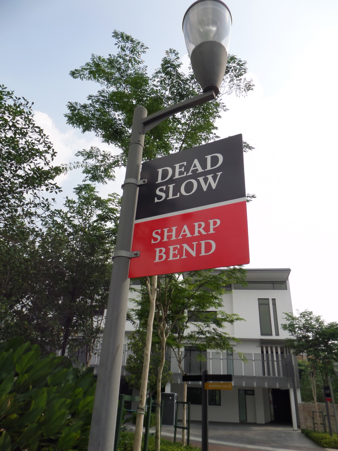
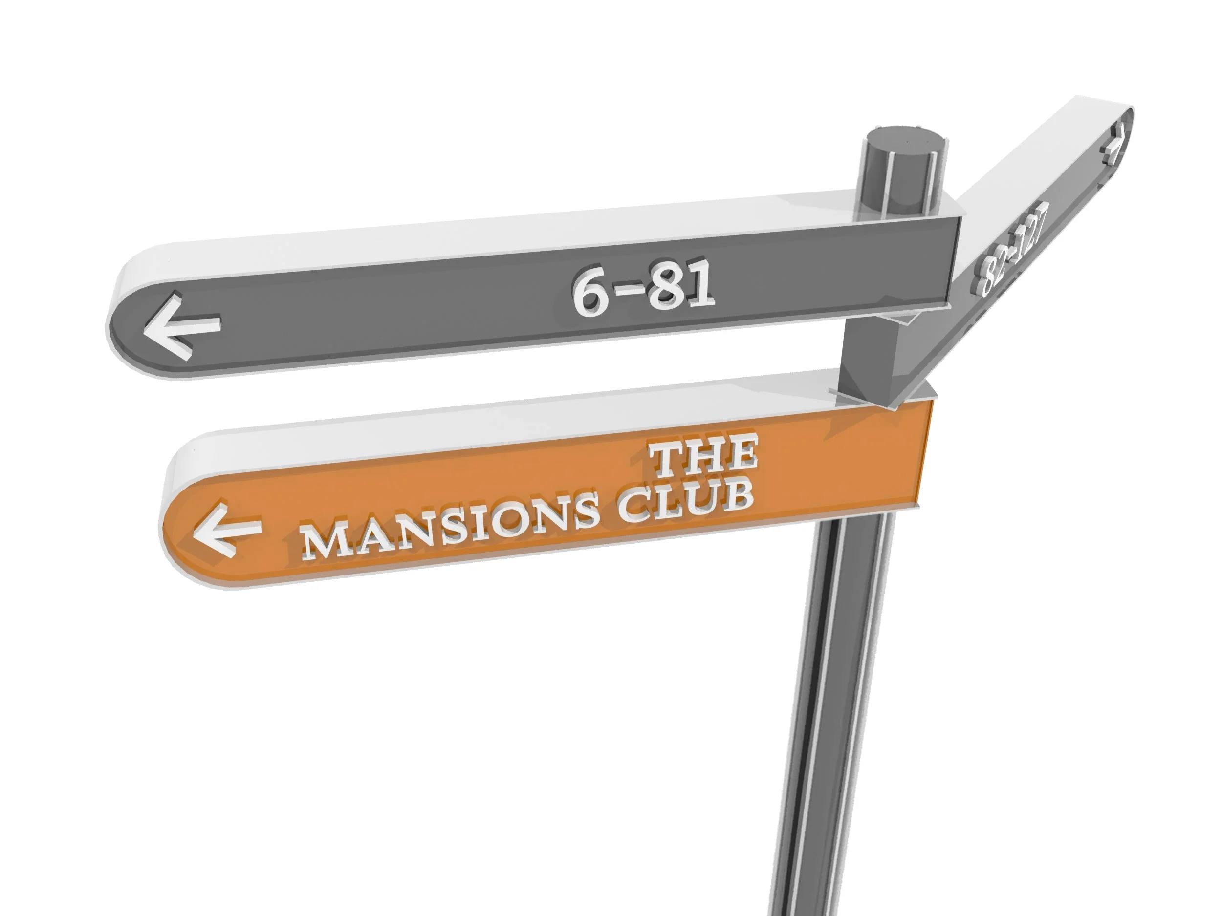
The right-angle turn is a relatively sharp and sudden one. Clear directional and caution signs, as well as hanging large lettering ‘VISITORS’ and ’RESIDENTS’ from the roof beam of the entrance portal, help visitors negotiate their way easily and safely.
Well-designed signs placed at the right spots can help a driver make the right split-second decision.
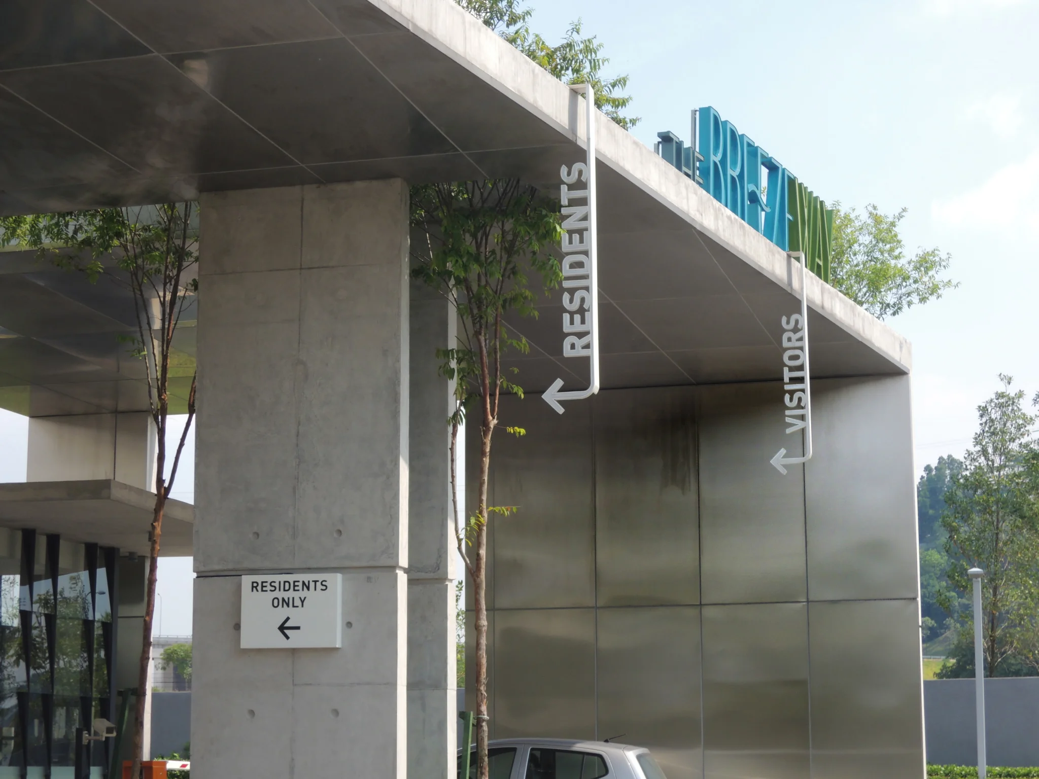
Breezeway
Breezeway faces a similar safety issue as its Resident’s and Visitor’s entrance lanes are at a sharp, abrupt 90° bend. It is made even riskier by the fact that visitors would be turning in from a main road, where cars tend to be moving faster.
Our solution was to install hanging signs that clearly mark the two entrance lanes, which are brightly illuminated at night.
Aesthetics
The Mansions
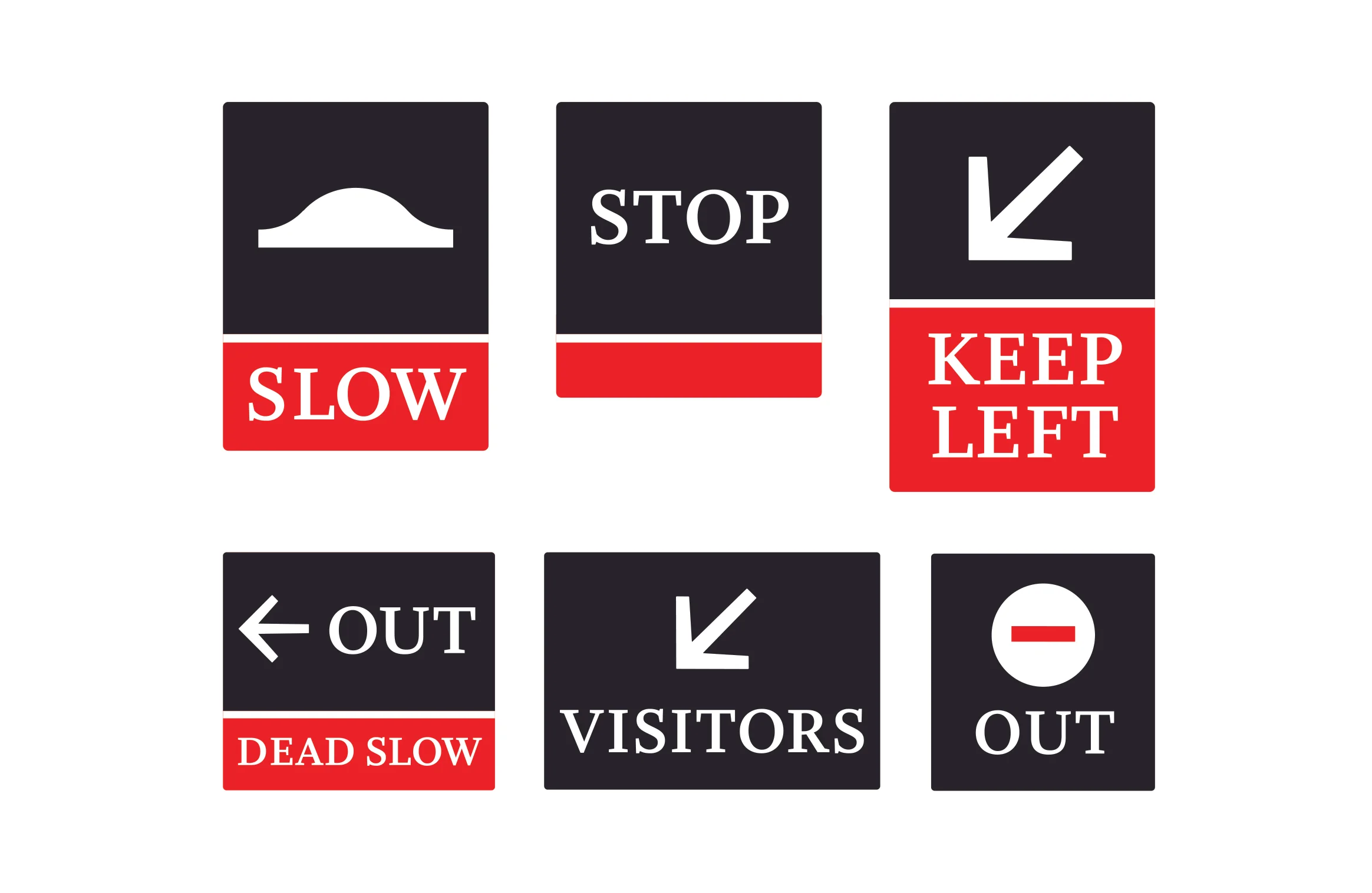
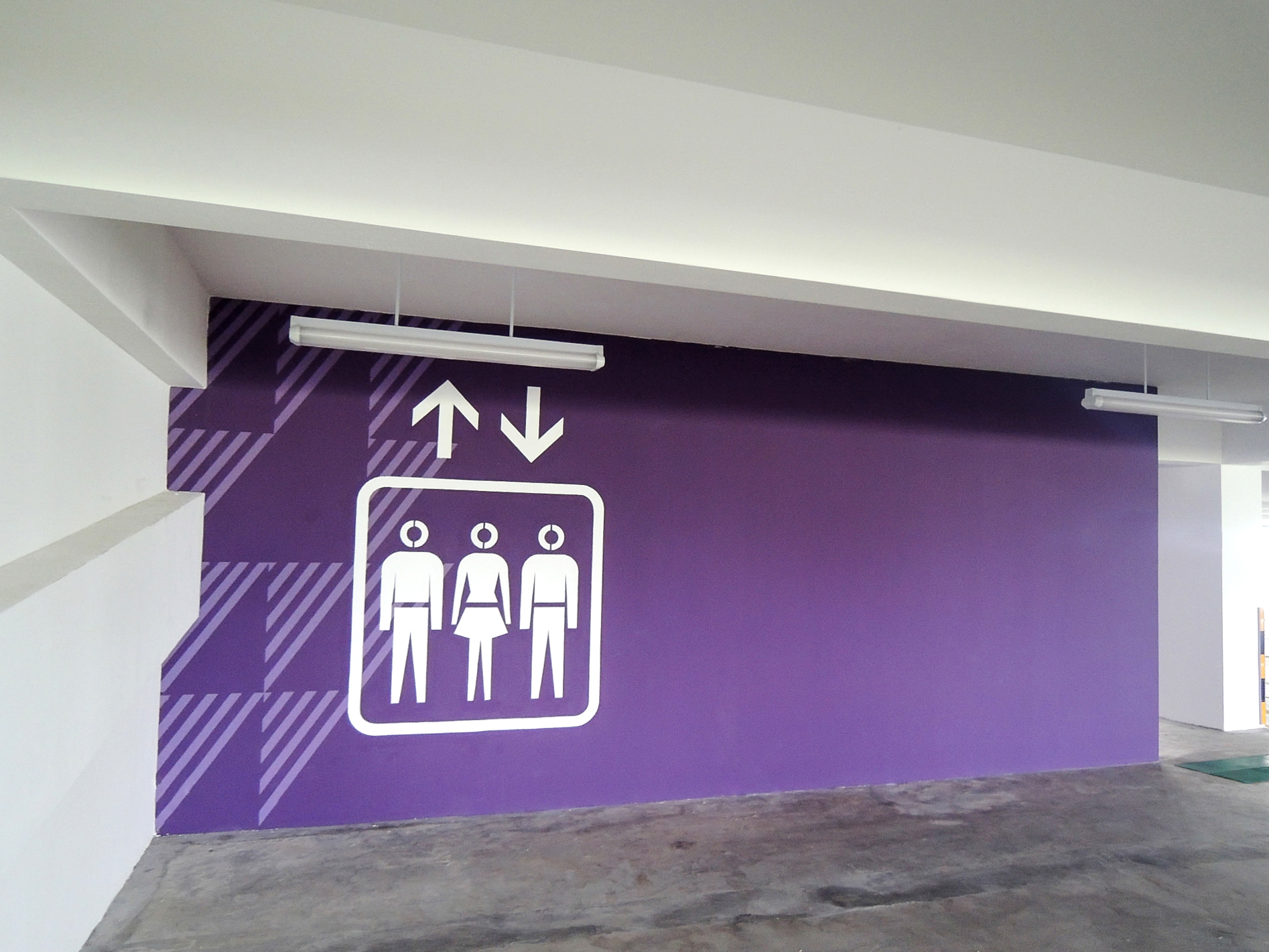
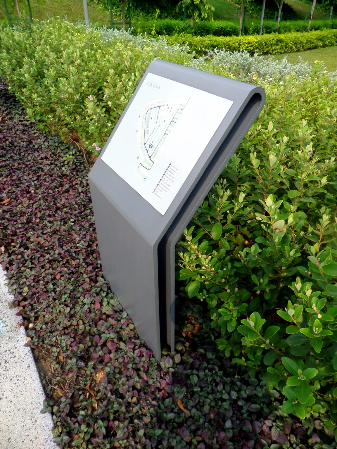
The Mansions is the most premium of the three properties. Internal road signs were specially designed to add to the exclusivity of the place. The simple design and typography provided navigational clarity for users.
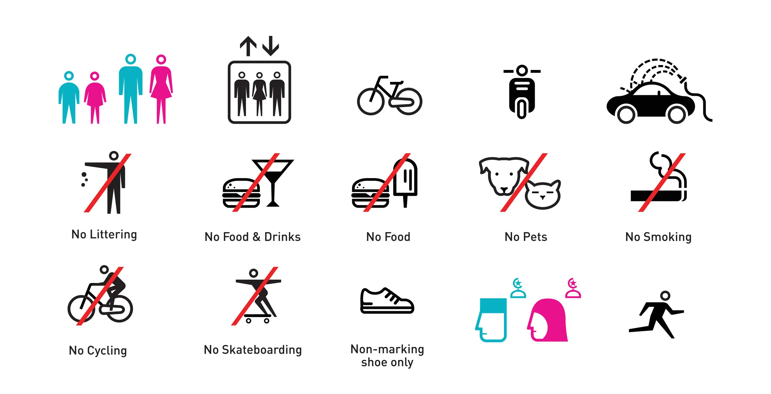
PICTOGRAPHS & COLOUR PALETTE
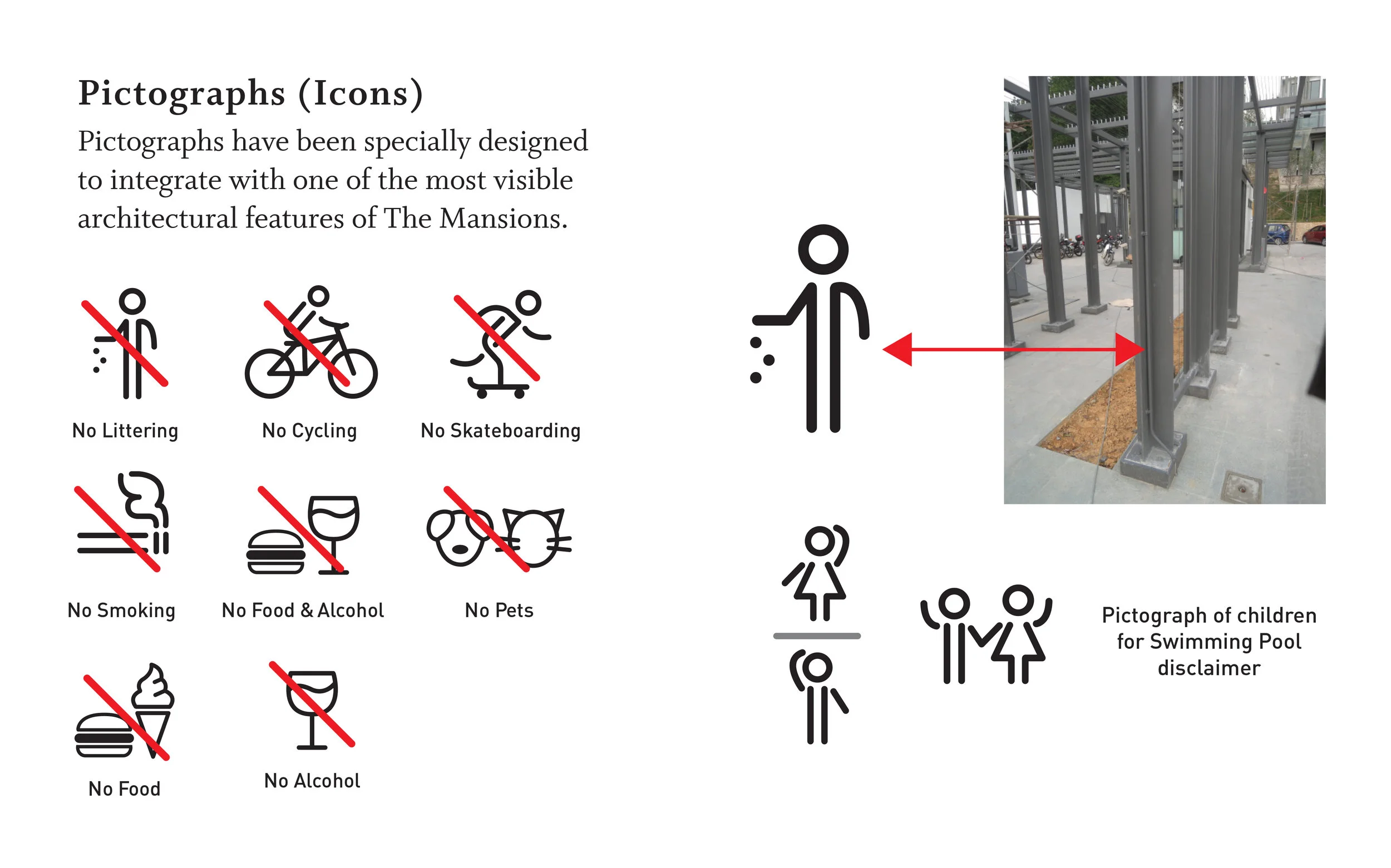
Pictographs were specially designed to highlight the defining characteristics of the three properties. Our inspiration came primarily from the pre-existing brand identity and colour concepts (previously created by other ad agencies).
The Mansions
This development features a modern industrialist vibe that is both smart and edgy. It is distinguished by the liberal use of T-beams and exposed cross beams in its architecture, and this became the basis of the pictographs for this property.
Breezeway
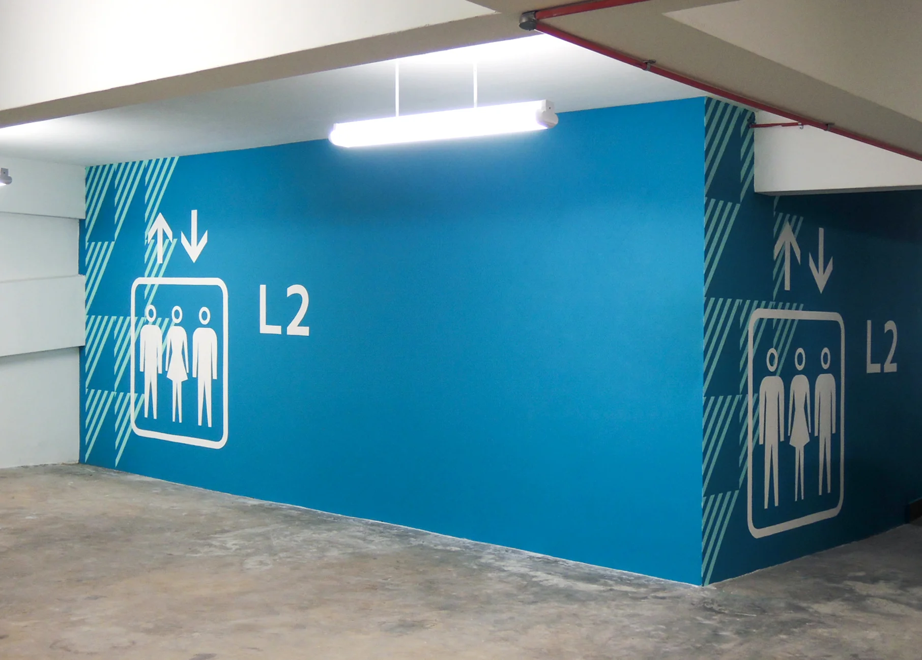
Breezeway comprises Courtyard Parkhomes and Garden Condos, and it promotes a gentler, more amiable personality which stands out from the raw concrete, glass, and steel material of The Mansions. This personality is conveyed through the landscaping and the softer colour palette and pictograph forms.

Our sign design for Breezeway strived for simplicity and clarity, with a primary colour palette of black, white, and the two logo colours—cyan and olive green. The wave logo element appears in mirror-coated stainless steel; and for some signs, is backlit for night view.

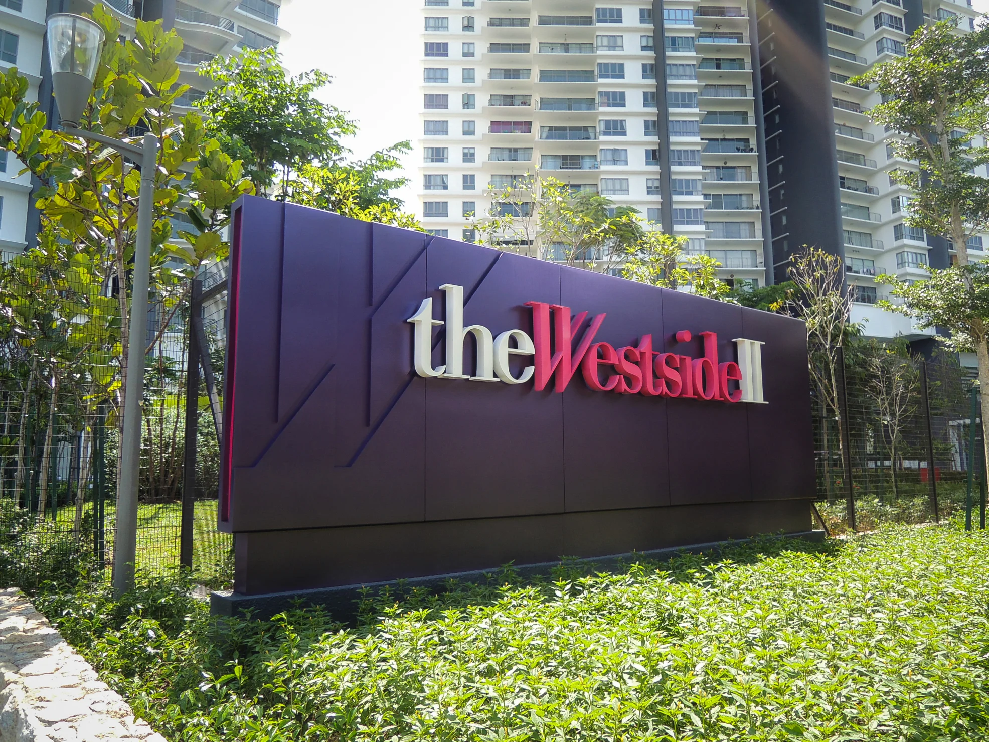
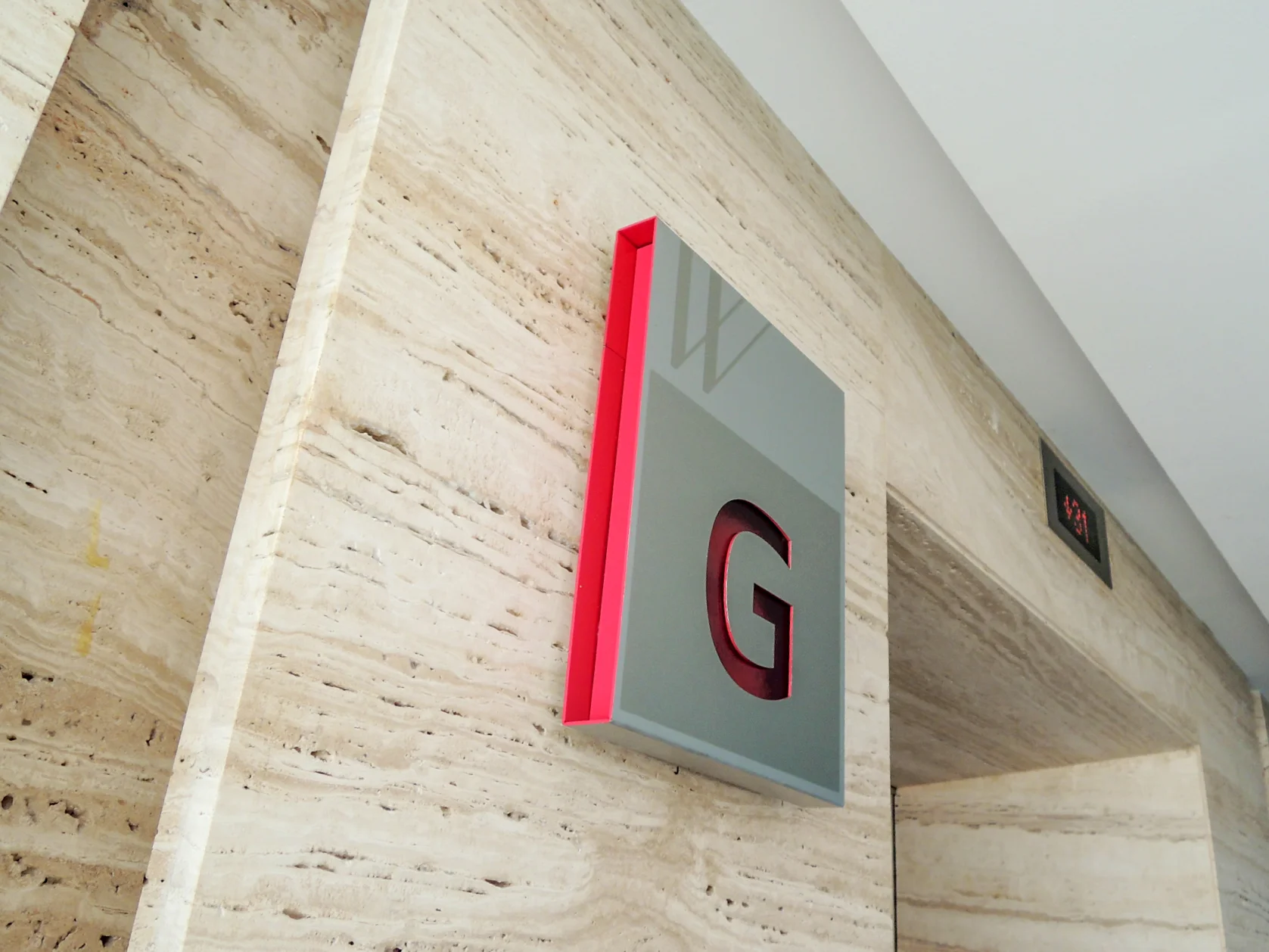
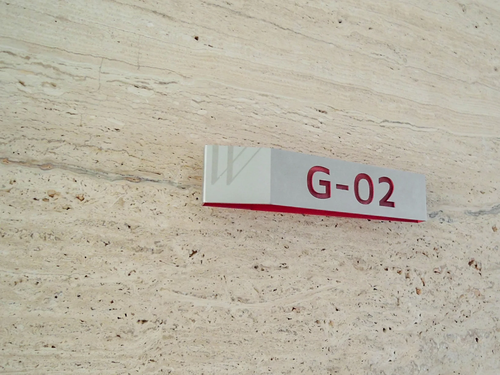
Westside II carries the most vibrant personality of the three properties—dynamic, energetic, and spirited—which is reflected in the pictographs and the bright and vivid colours used for its visual identity.
Our sign design for Westside II hinges considerably on its colour play: the two logo colours, turquoise and fuchsia, and a deep rich purple (derived from a mix of the two colours).
The exterior signs make a bold statement and is especially beautiful when lit up at night.
For the interior signs, letters are cut out on the outer layer of these signs to display the accent colours on the inside layer.
We expanded the colour palette for Westside II as more hues were needed to colour-code the car park levels.


TYPOGRAPHY
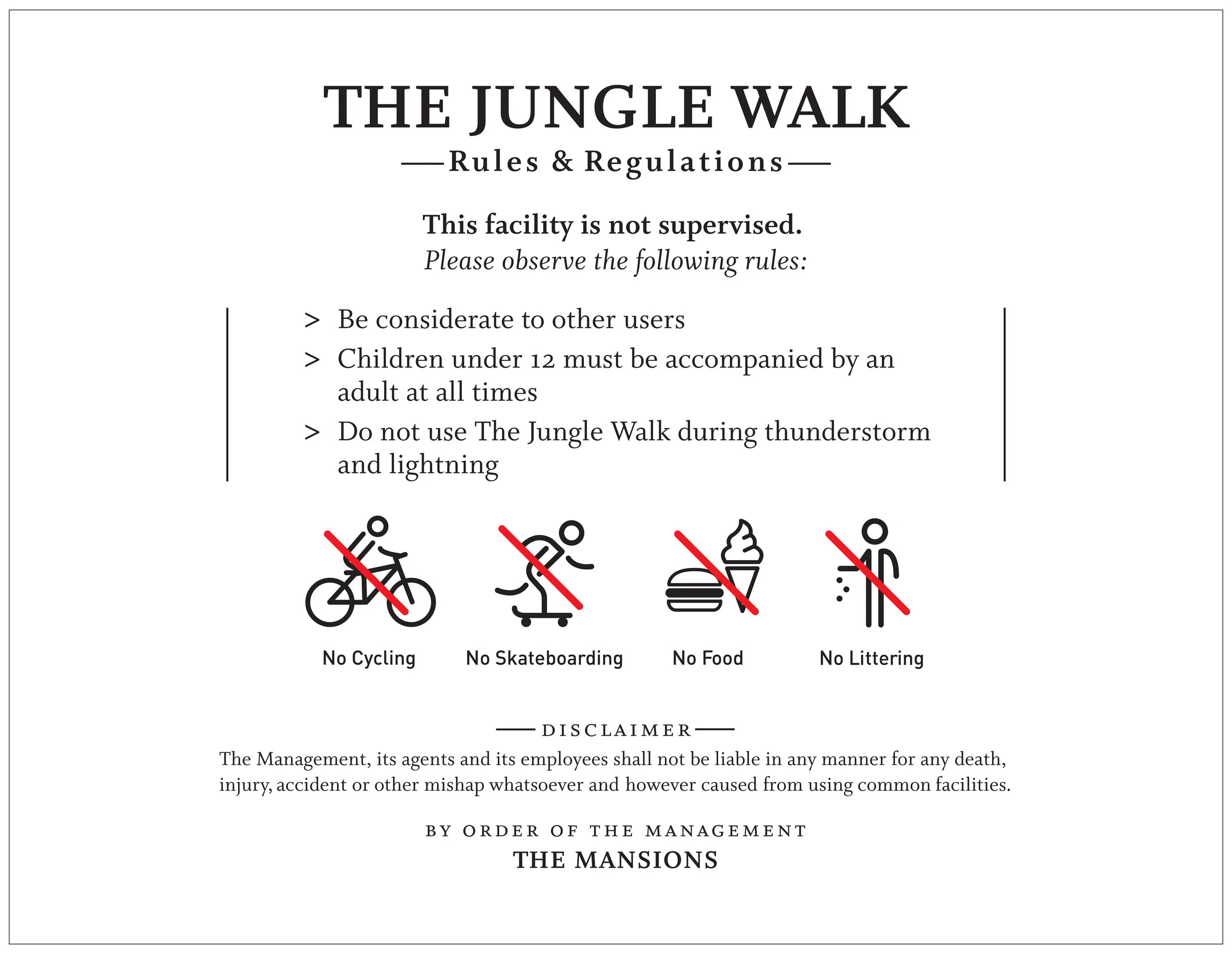
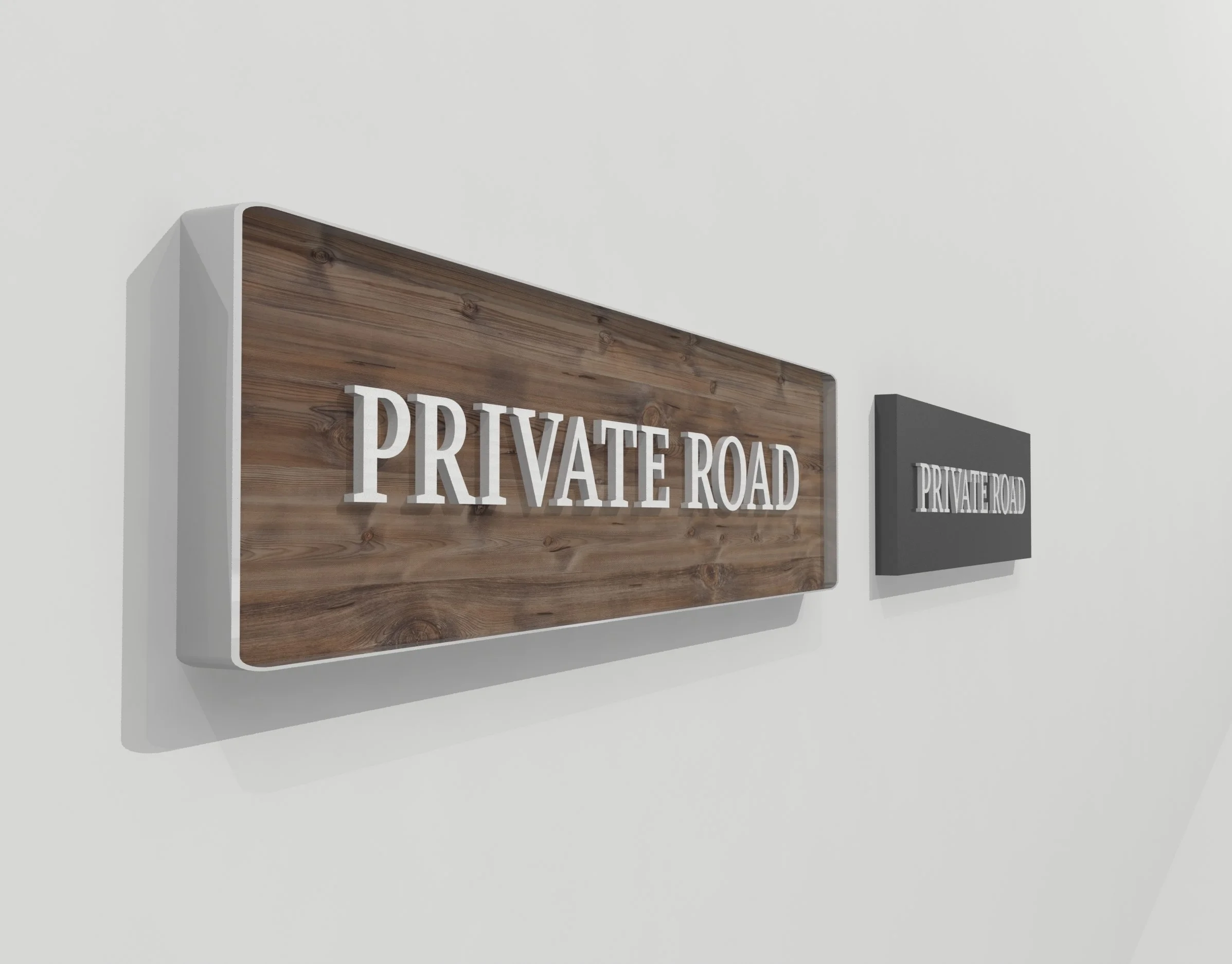
It’s unfortunate that very little attention has been given to typography in cautionary and regulatory signs in most developments. Good typography is essential to ensure clarity and readability, as well as to enhance the character of the development.
The Mansions


A standard layout for the Playground sign was redesigned (top centre) to keep in character with the premium status of the development. We made the pole-mounted Playground sign slim and small so as not to obstruct the view. The Gymnasium sign is wall-mounted next to the gym’s entrance.
Exploration of sign materials
Understanding materials and fabrication methods is important in all phases of a project, and it helps to avoid unnecessary delays translating drawings into real signs in the final stage.
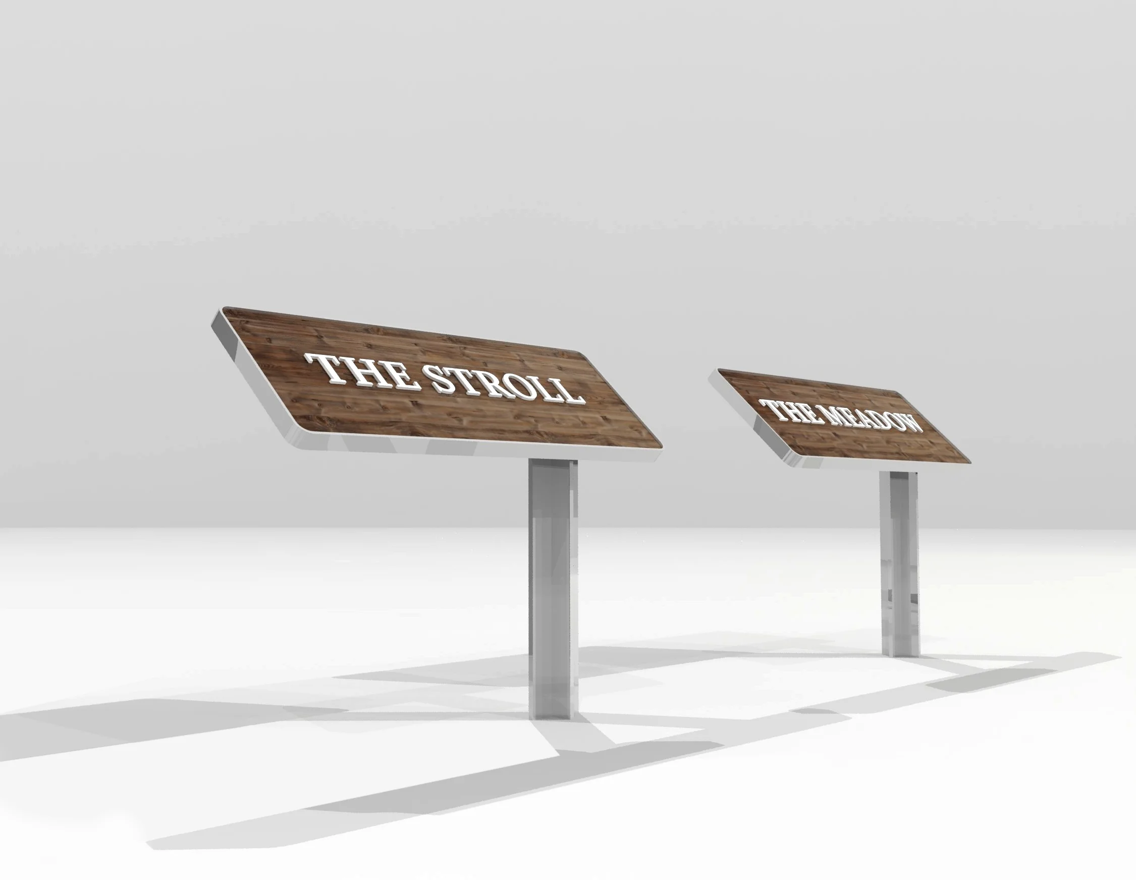
The Mansions
We made 3D explorations of two potential sign materials that could properly capture the premium edginess of The Mansions: a wood-based sign framed with mirror-coated stainless steel and a simple aluminium sign spray-painted with neutral grey.
Although wood was the ideal material in terms of the architectural scheme, the aluminium option was selected because of its durability (being exposed to the elements) and ease of maintenance.
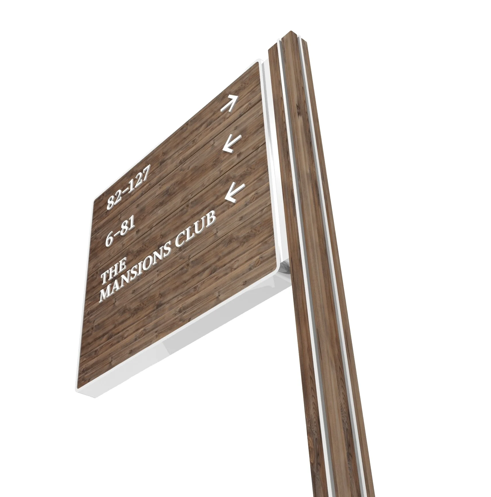

In the final design, we adapted the T-beam, used by the architect as a visual statement, for all pole directional signs, which serves to further cement the identity of the development.