Project / twentyfive.7, Kota Kemuning
Task / Visual Identity Design, Brand Communications
Client / Gamuda Land
Year / 2017
twentyfive.7 is a stylish mixed-use development that redefines Gen-X and Gen-Y living. The development spans 257 acres and centred on the ‘Brand Pyramid’: the Quayside, a creative retail hub by the waterfront, designer homes and community.
We created a distinctive visual identity based on the architect’s three-dimensional folding planes in the design of the Entrance Statement, children’s play slide and urban furniture.

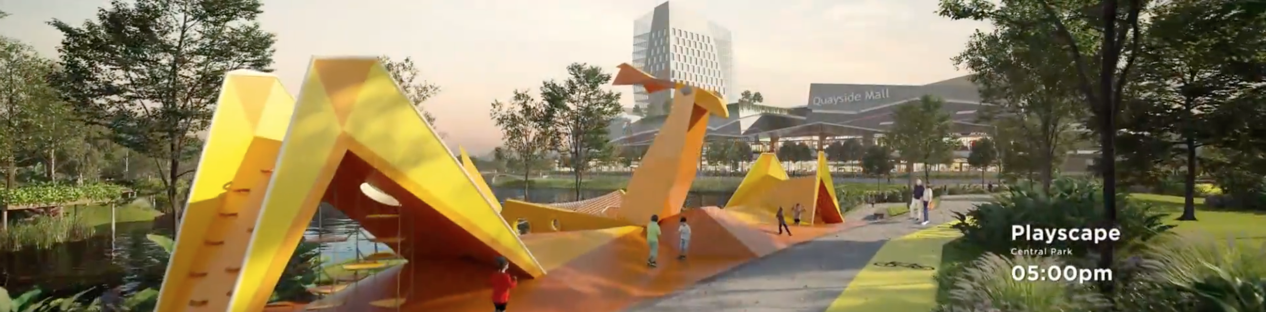
The video at the Sales Gallery tells the story of a day at twenty-five.7.
“Designing for twentyfive.7 is like aiming at a moving target, with constant fine-tuning of concepts and architecture due to the challenging market conditions.”

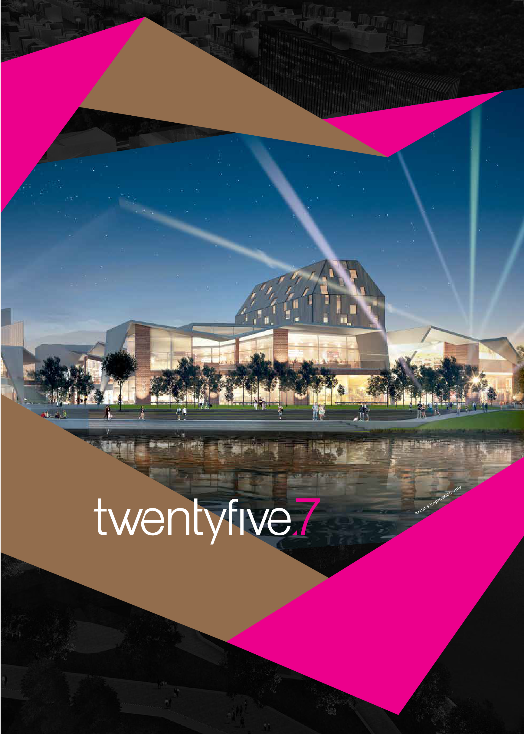
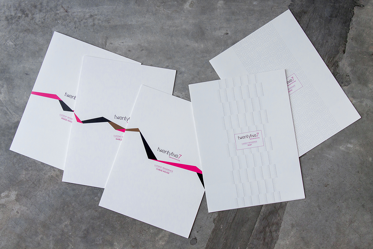
The colour scheme—a combination of black, fuchsia, bronze, white, and grey—conveyed the right sentiments for twentyfive.7, a sleek elegance that is also passionate and vivacious.
We incorporated these elements in the teaser video, retail leasing brochure, marketing collaterals, and continue to use them as a defining style of twentyfive.7.

The Brand Pyramid. An info-graphic that shows twentyfive.7’s USP.