
Project / Hotel Maya, Kuala Lumpur
Task / Logo and Visual Identity Design, Operational and Marketing Collateral, Brand Communication, Signage
Client / Selangor Dredging Berhad
Year/ 2005—2006
A collaboration with architects Chan Sau Yan Associates / C’arch Architecture & Design
Built in 1996, Hotel Maya underwent an extensive refurbishment to start its new life as Malaysia’s first 5-star boutique urban resort in the heart of Kuala Lumpur.
We started work on the hotel after completing the new corporate identity for its owner, Selangor Dredging Berhad (SDB), and branding for SDB’s first luxury product, Parc 7.
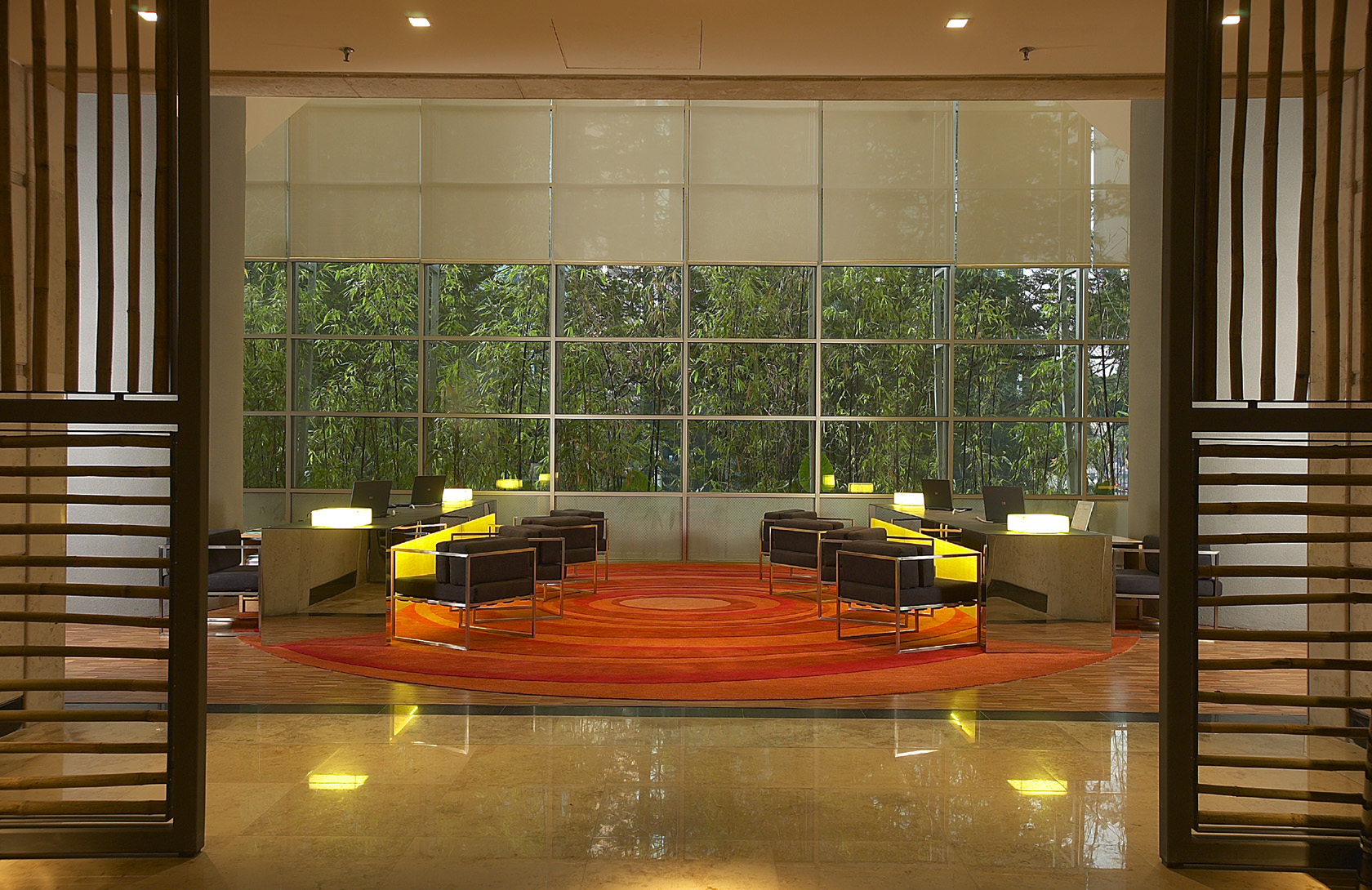
Hotel Maya makes a very strong and distinctive interior architecture statement with its extensive use of bamboo panelling, various areas that incorporate flowing water, and a rust-bronze mild steel spiral staircase centrepiece that resonates with sculptural impact.
The new logo combines the assertive form of the bronze staircase with the soft flow of water.
“When we design a visual identity, it is important for it to integrate with the vision of the client, the expectations of the customer, the design intent of the architect, and the colour, material and ambience of the physical environment.”


As a counterpoint to the bold architectural statements, images that convey a sense of comfort, pampering and simple luxury were introduced into the visual identity design.


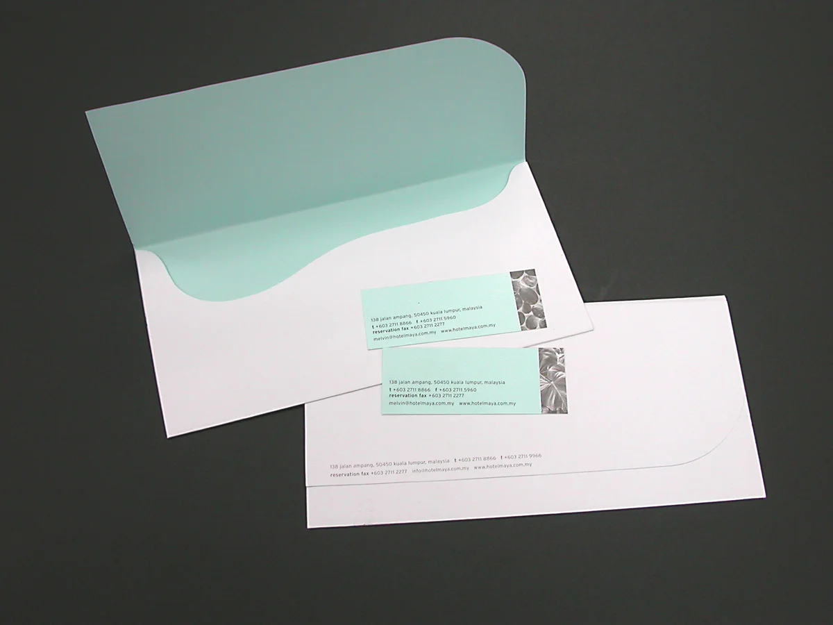
Tapestry-like compositions of nature and light were created for the visual identity and applied to the hotel's stationery and other collateral.


Our design work covered all materials required by the hotel to start operations.
Hoarding (first opportunity to communicate the new brand to the public)
Operational collateral for room and facilities (including the lobby lounge, café, restaurants, etc)
Banquet Brochure and Kit
Wedding Package Brochure
Conference Package Brochure
Advertising and Promotional materials
Stationery
Staff Manual
Signage
Two sets of descriptors were created for Hotel Maya and used in promotional materials:
‘simplicity. modernity. comfort.’ and ‘different. fresh. inspired.’

Many collaterals feature a bamboo motif as bamboo panelling and bamboo plants are found in many areas of the hotel.

Simplicity and sophistication expressed through a restricted colour palette of bronze, eggshell blue and black for the hotel’s main brochure.


Our team designed all the exterior signages while the interior signs were designed by the architect using the same typeface and identity specified in our visual identity guidelines.


